Successfully Evolving Coffee Branding with Koppi Co-Founder Anne Lunell
| Cropster
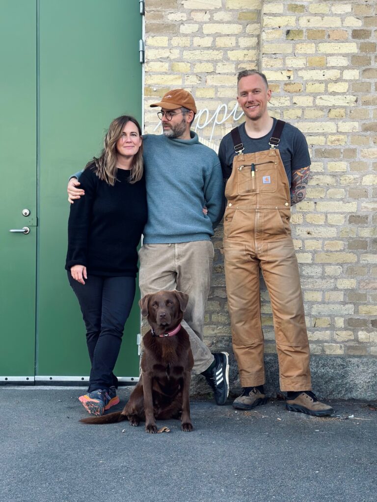
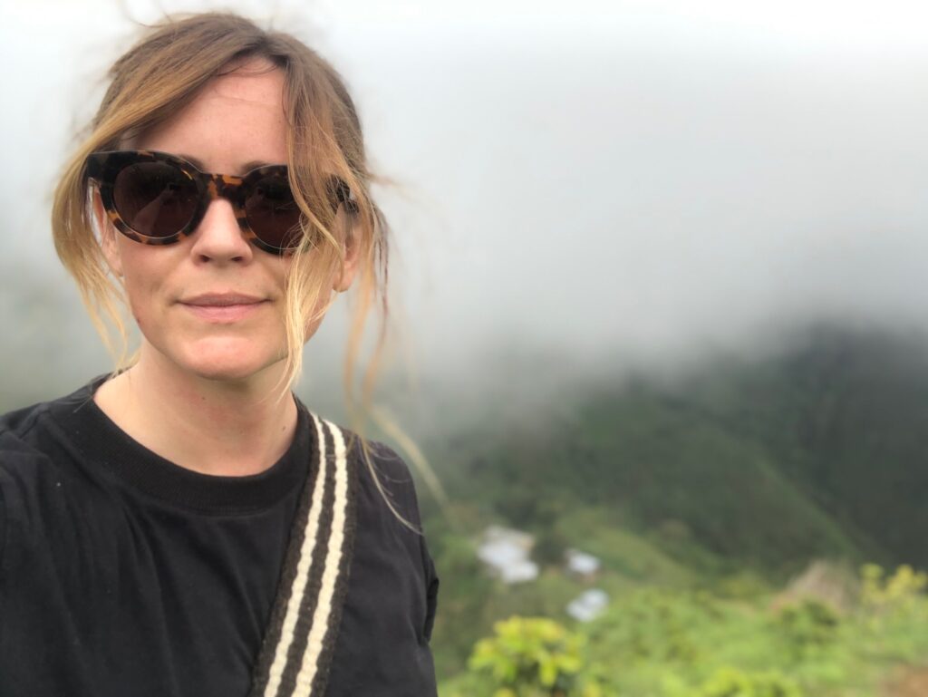
Koppi, a beacon for specialty coffee lovers from Helsingborg, Sweden, began its journey in 2007. Founded by Anne Lunell (2006 Swedish Barista Champion & winner of 2016 Swedish Brewer’s Cup) and husband Charles Nystrand (2005 Swedish Barista Champion), Koppi started as a cafe roasting its own coffee, and then rapidly becoming a destination for coffee tourists from all around the world as one of the first specialty cafes in the Nordic countries. Today, Koppi focuses only on coffee roasting, known for not only its exceptional coffees but also its rich, evolving brand identity. Anne Lunell takes us behind the scenes of Koppi’s branding journey, giving insights on how their brand evolved alongside their coffee.
The Roots of Koppi’s Branding
Koppi’s initial branding was rustic and industrial, mirroring the artisanal style of the time, influenced by American brands like “Stumptown.”
“Our branding was quite industrial,” Anne reflects. ”After building the cafe and roastery we didn’t have much money left for branding so we relied on getting some help from a couple of friends. Styles and fashion were different back then too,” Anne Lunell explains.
The Packaging
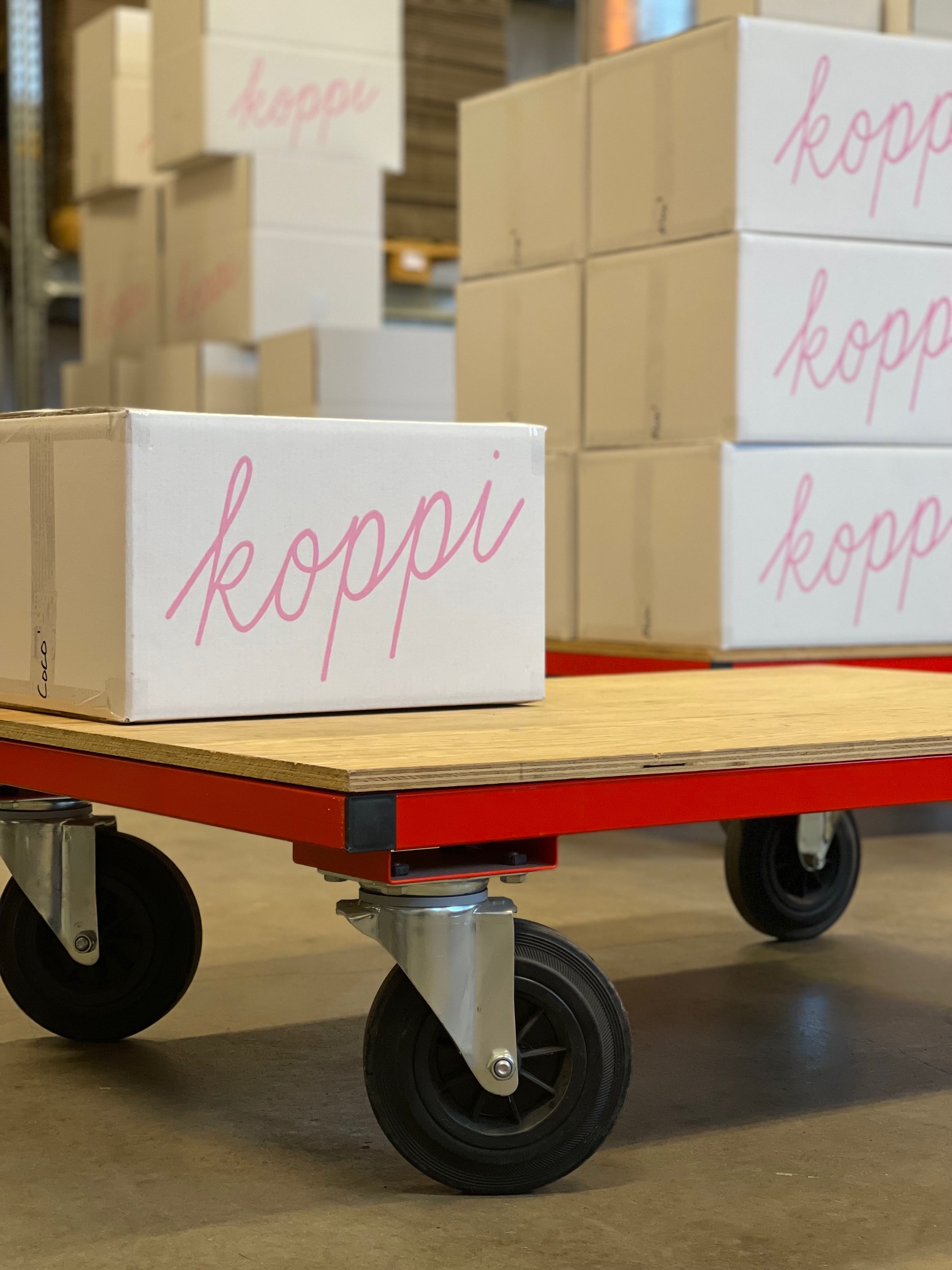
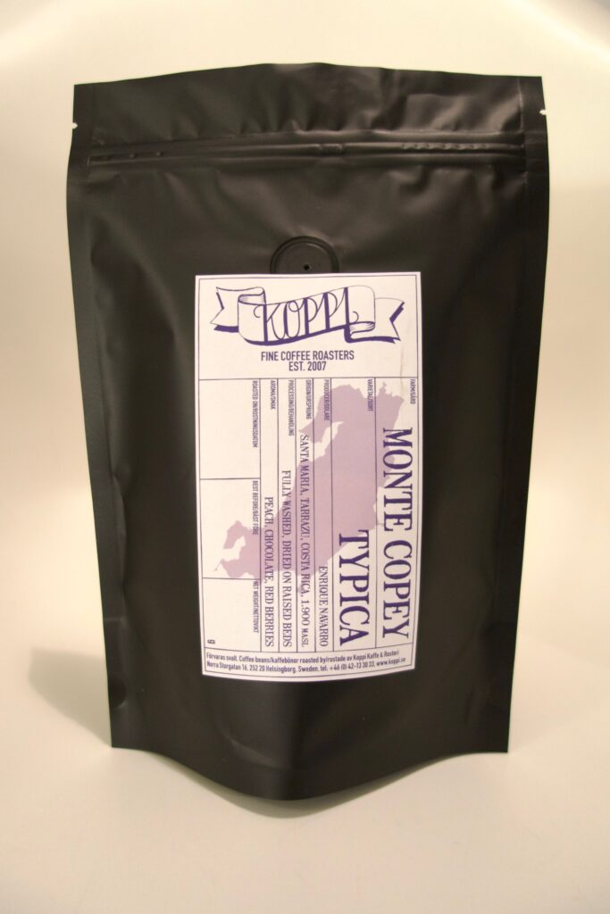
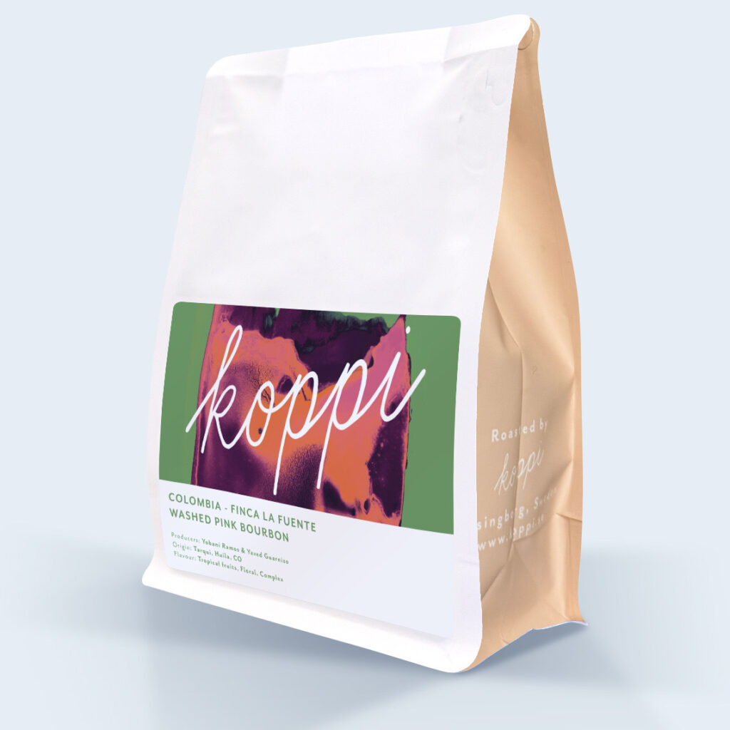
As Koppi’s reputation grew, Anne saw the need to shift from industrial matt black bags to more refined packaging. “The old branding didn’t match our evolving brand identity anymore. We wanted to showcase the producers and their coffees in a better, more serious and clear way. ” Approximately 7-8 years in, it was time for a new look.
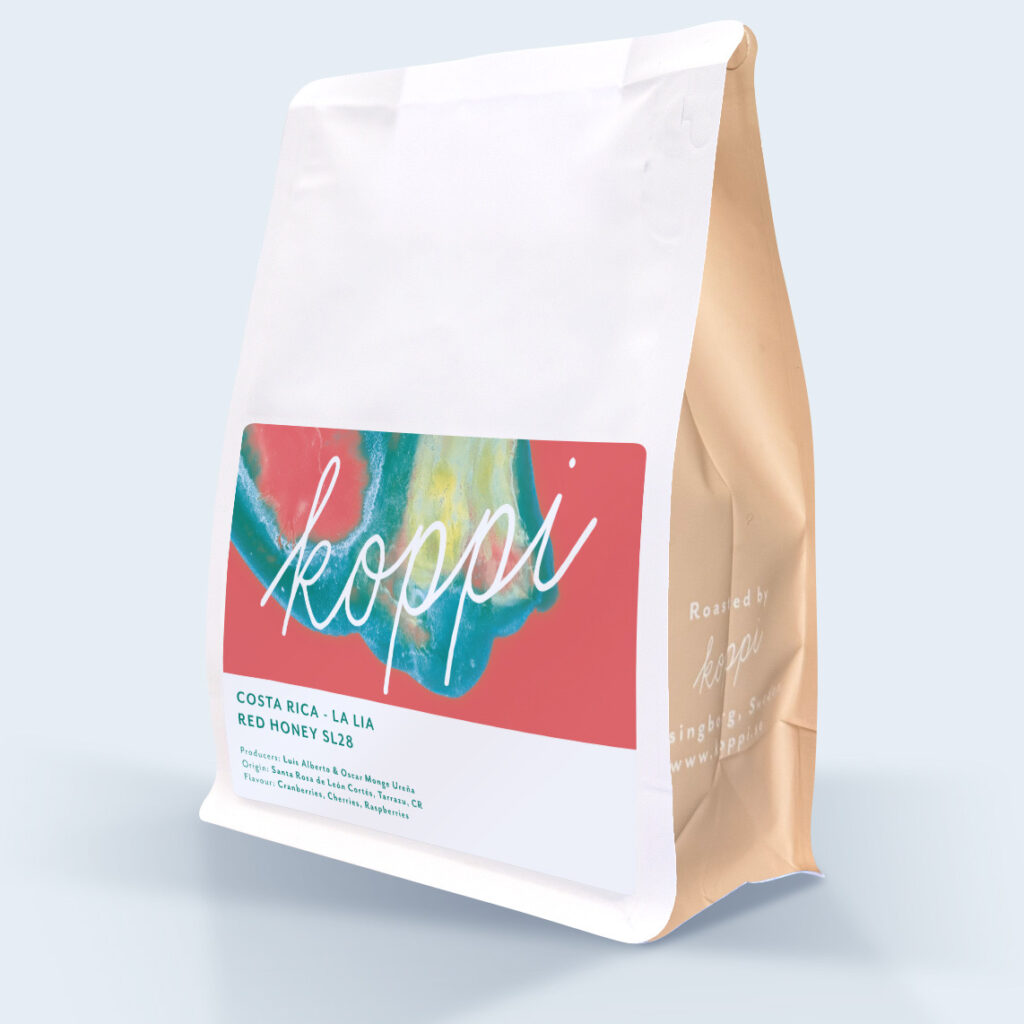
Through observing customers in their cafe and listen to why they chose particular coffees, Anne found that colors and country origins were key recognition factors. She incorporated these elements into the new branding. Art from a team-building exercise transformed into the packaging’s design, with the colors Anne, as the green buyer, selects subtly representing the flavors. Their former employee Clara Blomqvist Jones, now continues to create this art.
The artwork changes regularly with each producer and also variety, a strategy inspired by luxury chocolate brand MAST and its exclusive packaging. “I enjoyed the ever-changing style. It always gives something to look forward to, it keeps you interested ” Anne says of the evolving art on their packaging.
The Logo
As the old logo clashed with the new packaging, Anne incorporated their additional logo – a clean and simple script logo that was initially used on merchandise. It quickly became evident that a cohesive rebranding—integrating logo and packaging—was necessary. This led to a year-long redesign that cultivated the elegant, clean aesthetic that defines Koppi today.
Advice for Aspiring Brands
Throughout their evolution, Anne emphasizes understanding your brand identity and values. “Branding is crucial, but understanding why you do what you do and how you want to do it is most important.” Her advice for new ventures? “We never wanted to grow just for the sake of growing. We want financial stability for us and our long-term partners.” This focus underpins Koppi’s enduring success. “And remember not to take everything too seriously—have fun,” Anne adds with a laugh.
Koppi’s evolution offers this lesson: stay grounded, inspired, and let your brand authentically reflect your journey. As Anne sums up, “We just always stayed who we wanted to be.”